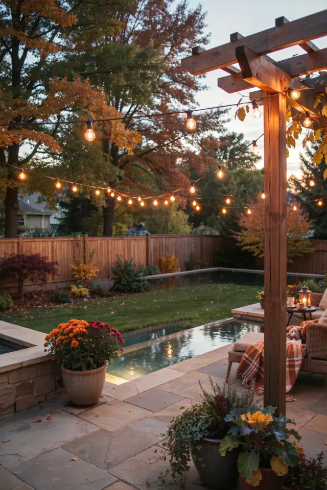
Choosing a Sherwin Williams whole house color scheme for an English Cottage palette sounds dreamy, right? Soft creams, muted greens, maybe a dusty blue. But here’s the thing: the biggest mistake people make is picking colors from flat swatches without testing them in real lighting. Especially if you’ve got a pool deck that connects to your interior. That transition from inside to outside? It can wreck your whole vibe. I’ve seen it happen. A warm ivory indoors turns into a cold gray under the sun. Suddenly your English Cottage palette looks more like a hospital waiting room. So let’s talk about how to avoid that specific disaster, and keep things warm and cohesive for that modern country farmhouse feel.
Why Your English Cottage Palette Feels Off Indoors vs Outside
Lighting is a liar. Not on purpose, but it changes everything. Your kitchen might have north-facing windows that cast a cool blue tone all day. Your living room gets golden afternoon sun. And that pool deck? It’s blasted by direct UV light that pulls out every hidden green or pink undertone. So a soft beige that looks perfect in the store’s fluorescent lights can suddenly read like baby poop on a sunny patio. Trust me, I learned this the hard way when my “warm white” trim looked blue next to my pool. I wanted to cry.
The English Cottage aesthetic depends on soft, earthy undertones. Pinks, peaches, greiges. Those shift dramatically between indoors and outdoors. You can’t trust a 2×2 inch chip. It’s not enough surface area to see the real character.
The Undertone Trap: Why Flat Swatches Lie to You
Swatches are tiny. They’re printed on cardboard that has zero texture or light absorption. Here’s what they don’t tell you: Sherwin Williams paints have different sheens, and the sheen changes how light bounces off the color. A flat finish soaks up light and makes the undertone darker. A satin or eggshell glows and brightens everything. So that swatch you’re holding? It’s basically a rough sketch, not the final painting.
Also, undertones are sneaky. A color like Sherwin Williams Repose Gray looks neutral in the store. But put it next to a warm beige, and suddenly it reads cool. Next to a true gray? It goes warm. Maddening. For an English Cottage palette, you want colors that lean slightly warm but not orange. Think creamy whites like Alabaster or Snowbound, and muted greens like Clary Sage. But even those have hidden pink or yellow bases. You have to test them.
Pool Deck Connection: The Lighting Shift Nobody Warns About
Ok so here’s the specific issue that drove me insane. My house has sliding glass doors that open straight onto a pool deck. I wanted the indoor paint to flow visually into the outdoor space. Easy, right? Wrong. The interior was painted in Sherwin Williams Kilim Beige – a lovely warm tan. But on the pool deck, the same color (used on a patio wall) looked greenish and dead. Why? Because the pool water reflects blue light, and that blue light mixes with the tan undertone and creates a muddy green. I had to repaint. Twice. Don’t be me.
If your house has a similar connection, you need to test your whole house color scheme at different times of day and in both inside and outside conditions. Put a large sample board (at least 2×2 feet) in the indoor space, then move it near the door. Then take it outside on the deck. Compare them side by side. Notice the shift. If it looks different, pick a color that holds its warmth in both lighting conditions. Something like Sherwin Williams Creamy or Shoji White often works better because they have balanced undertones that don’t go weird in sunlight.
Sherwin Williams Paint Colors That Actually Work Year Round
Not gonna lie, I have a shortlist of Sherwin Williams colors that behave themselves. They hold their warmth through changing light and don’t throw weird surprises. For an English Cottage palette with modern country farmhouse vibes, try these:
- Alabaster (SW 7008) – a soft white with a whisper of warmth. Great for walls, trim, and cabinets. Doesn’t go blue in shade.
- Accessible Beige (SW 7036) – a greige that actually stays warm. I use it in hallways where light shifts constantly.
- Sea Salt (SW 6204) – a green-gray that reads like sage in low light and seafoam in bright light. Perfect for English Cottage bathrooms or mudrooms.
- Repose Gray (SW 7015) – careful with this one. It’s a true gray but can feel cold. Pair with warm accents (wood, linen) to keep it cozy.
- Mountain Air (SW 6224) – a pale blue that reads soft and airy, not icy. Works beautifully in bedrooms with southern exposure.
Honestly, the best overall bet for a whole house scheme that connects to outdoor living is Alabaster on walls and Accessible Beige on trim. Sounds boring? Maybe. But it’s cohesive. And you can add warmth with pillows, plants, and wood furniture.
How to Test Paint Samples Like a Pro (Without Losing Your Mind)
Do not buy a tiny dab of paint. Go to Sherwin Williams and get those peel-and-stick samples. But wait – here’s the weird detail. I once painted a sample on a piece of drywall and left it in my car for a week. The heat from the sun made the color look completely different when I brought it inside. The paint had essentially “cooked” and changed its binder. Stick to the peel-and-stick swatches for accurate reading. They’re easier to move around too.
Test at three times: morning, midday, and late afternoon. Tape the sample on a vertical surface (not a table, because light hits from above). Stand back ten feet. Squint. Move it next to your furniture, your floor, your countertops. If you have a pool deck, also tape it to the house exterior near the door. Take a photo in each lighting condition. Compare them on your phone. Trust me, your eyes will trick you, but the photo won’t.
One more pro tip: paint a large board (like foam core) with your top two color choices. Then you can carry that board around the house and outside. It’s overkill? Maybe. But it’s cheaper than repainting an entire room.
Modern Country Farmhouse Vibe Without the Boring Beige
Everyone thinks “modern country farmhouse” means all-white walls with black windows. Zzzz. That’s so 2018. English Cottage palette brings more personality. Think warm ivory walls, sage green cabinets, maybe a dusty blue front door. It feels lived-in and soft, not sterile. But here’s the mistake: people pick colors that are too saturated. A deep sage might look great on a chip, but paint a whole living room in it and you’ll feel like you’re inside a pea.
Go lighter than you think. For a farmhouse with English Cottage charm, try Clary Sage (SW 6178) on an accent wall and keep the rest in Alabaster. Or use Urbane Bronze (SW 7048) on the exterior door for that grounding earthy pop. The key is restraint. Use the strong color in small doses. Let the wood tones and natural light do the heavy lifting. And for heaven’s sake, don’t match your furniture to the walls. That’s how you get a boring beige prison.
One Weird Trick: The Seasonal Color Drift You Need to Know
Here’s a thing nobody talks about: your whole house color scheme will change between summer and winter. In summer, when the sun is high and trees are full, the light coming into your house is greener and warmer. In winter, the low sun casts a cooler, grayer tone. So a color that looks perfect in June might feel dingy in December. I learned this when my beautiful warm beige living room turned flat and sad every January. Had to add a huge mirror and a warm throw blanket to compensate.
If you’re planning a palette that has to work year-round – especially if your pool deck is only used half the year – choose colors that handle that drift gracefully. Avoid colors with strong yellow undertones (they look jaundiced in winter) and avoid cool grays (they look like ice in summer). Stick to colors with balanced undertones: pale neutrals like Natural Linen (SW 9109) or Moth Wing (SW 9174). Those adjust without turning ugly. Another little trick? Add a warm light bulb (2700K to 3000K) in your lamps. That fixes winter blahs instantly.
Anyway, don’t overthink it. Test, test, test. And save this post for your paint planning. Seriously, your future self will thank you when your English Cottage palette stays beautiful indoors and out, no matter the season or the pool reflection.
#wholehousecolorscheme #sherwinwilliamspaint #englishcottagepalette #moderncountryfarmhouse #paintcolorhelp
Leave a Comment